The pharmaceutical industry is and has long been a business of trust, especially when prospective clients include pharmacies and hospitals. With a sensitive product offering and a supply chain that is integral to the wellness of millions of people, Daccord Pharma wanted to put across that same trustworthiness.
In addition to the trust factor, Daccord Pharma also requested an identity that highlighted its other values of inclusion, innovation, and social responsibility.
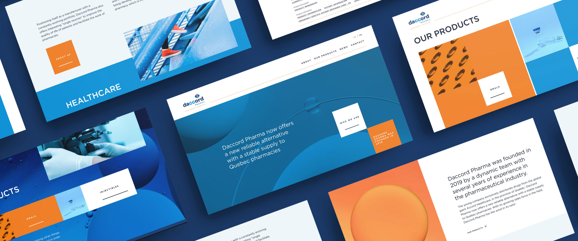
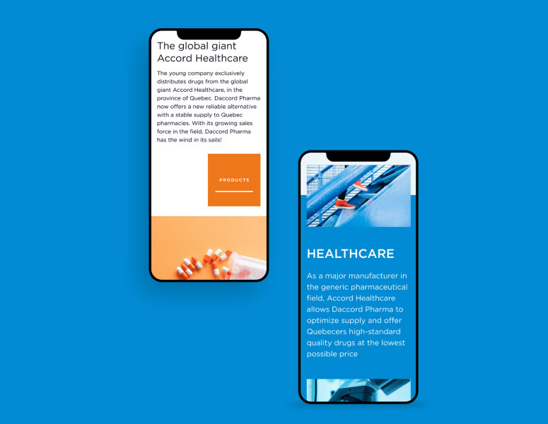
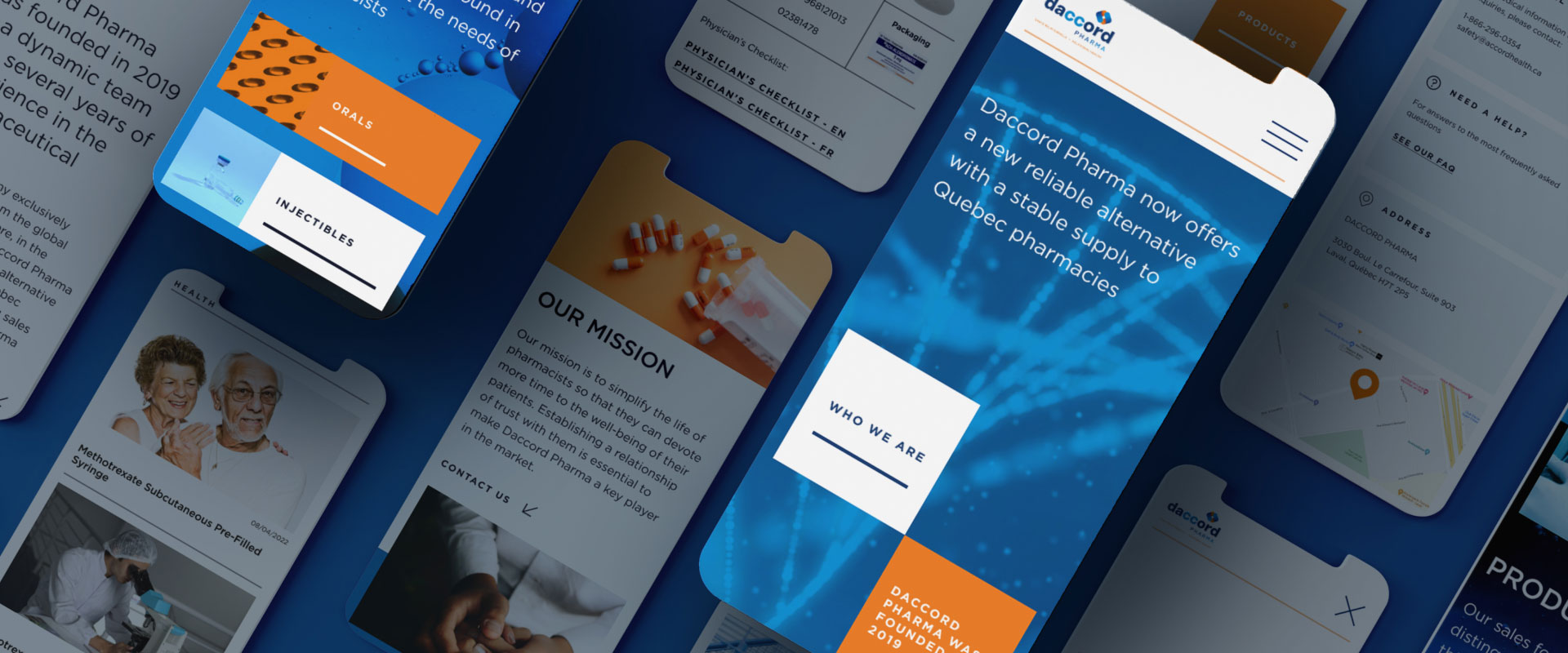
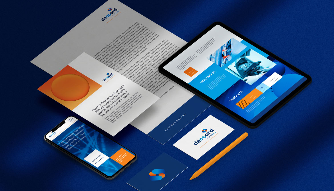
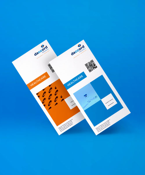
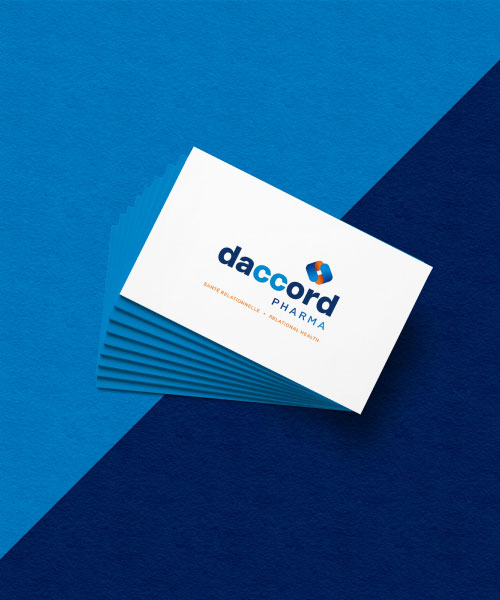
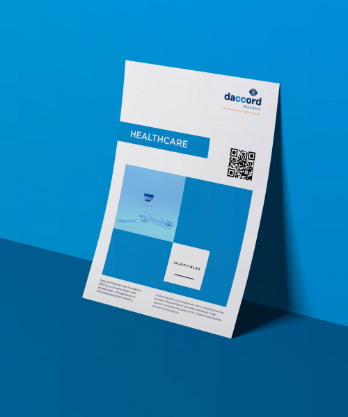
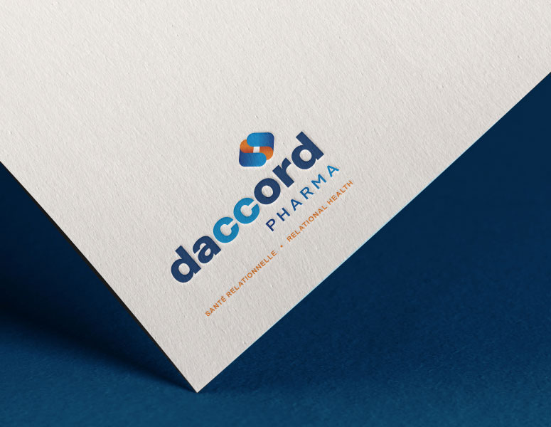
Kromad were mandated to re-do the company’s logo, entire corporate identity and website development. A full suite of services to reimagine the brand in a constantly evolving industry.